I had a lot of fun with this one! It was very inspired by lyrics to my favorite song and the Japanese print “Great Wave off Kanagawa.”
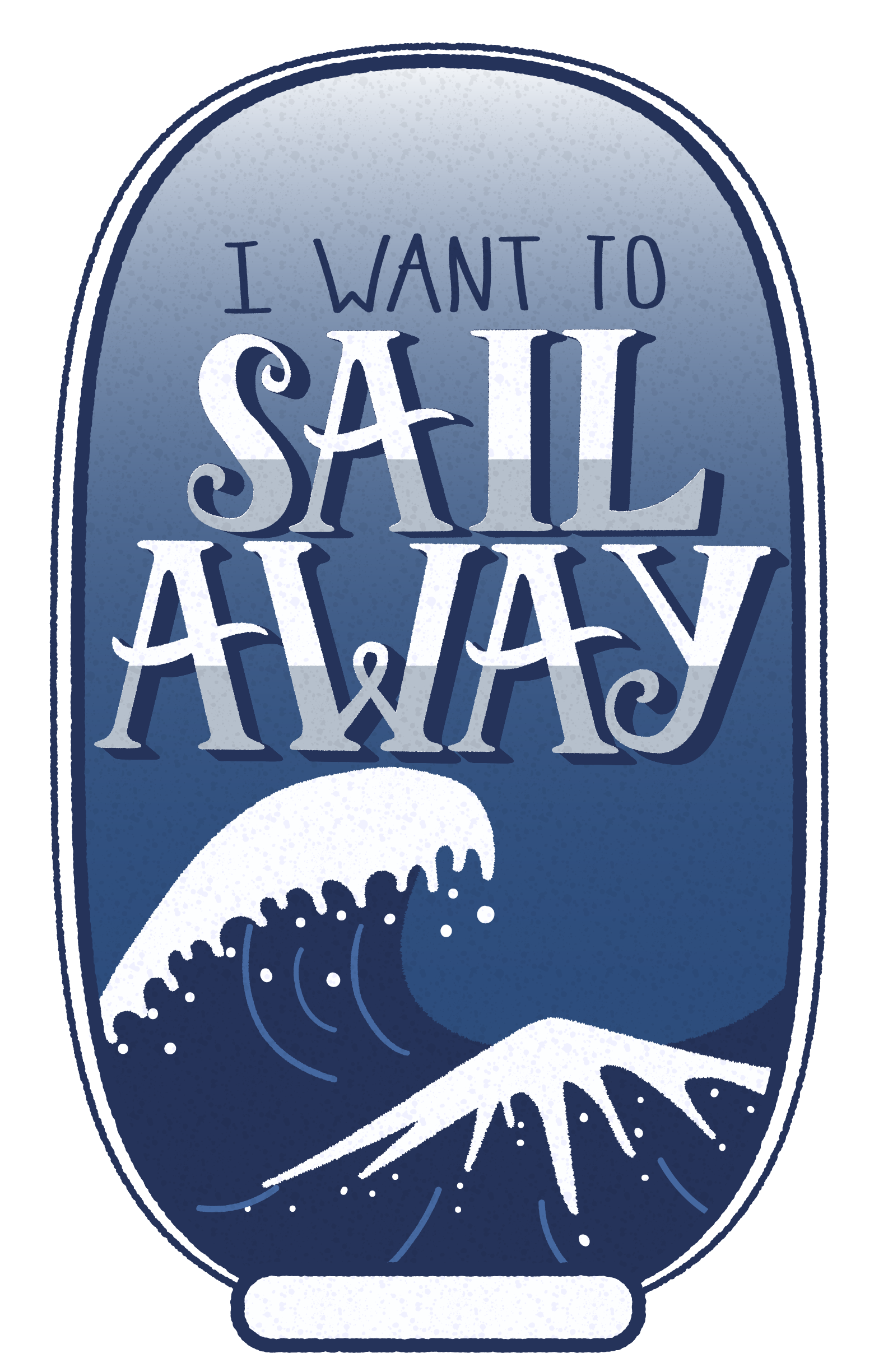
I had a lot of fun with this one! It was very inspired by lyrics to my favorite song and the Japanese print “Great Wave off Kanagawa.”

hi ash, i really like the illustration you made! the gradient background is much more visually interested than if it was just a solid color, and i really like the different shades of blue that you used! the whole illustration feels very put together. the only thing that i noticed is the little box at the bottom. i’m sure it was just for decorative purposes but it feels out of place to me, but it’s not distracting or anything. other than that you did a really great job!
LikeLike
Ash, I love your finished product! it is amazing and so very clean. I love it, and I can definitely see your inspiration. The only change I would make would be more font/hand lettering variation. Though, I love how it is like this. You definitely know your way around Illustrator :-}
LikeLike